Branding
〰️
Branding 〰️
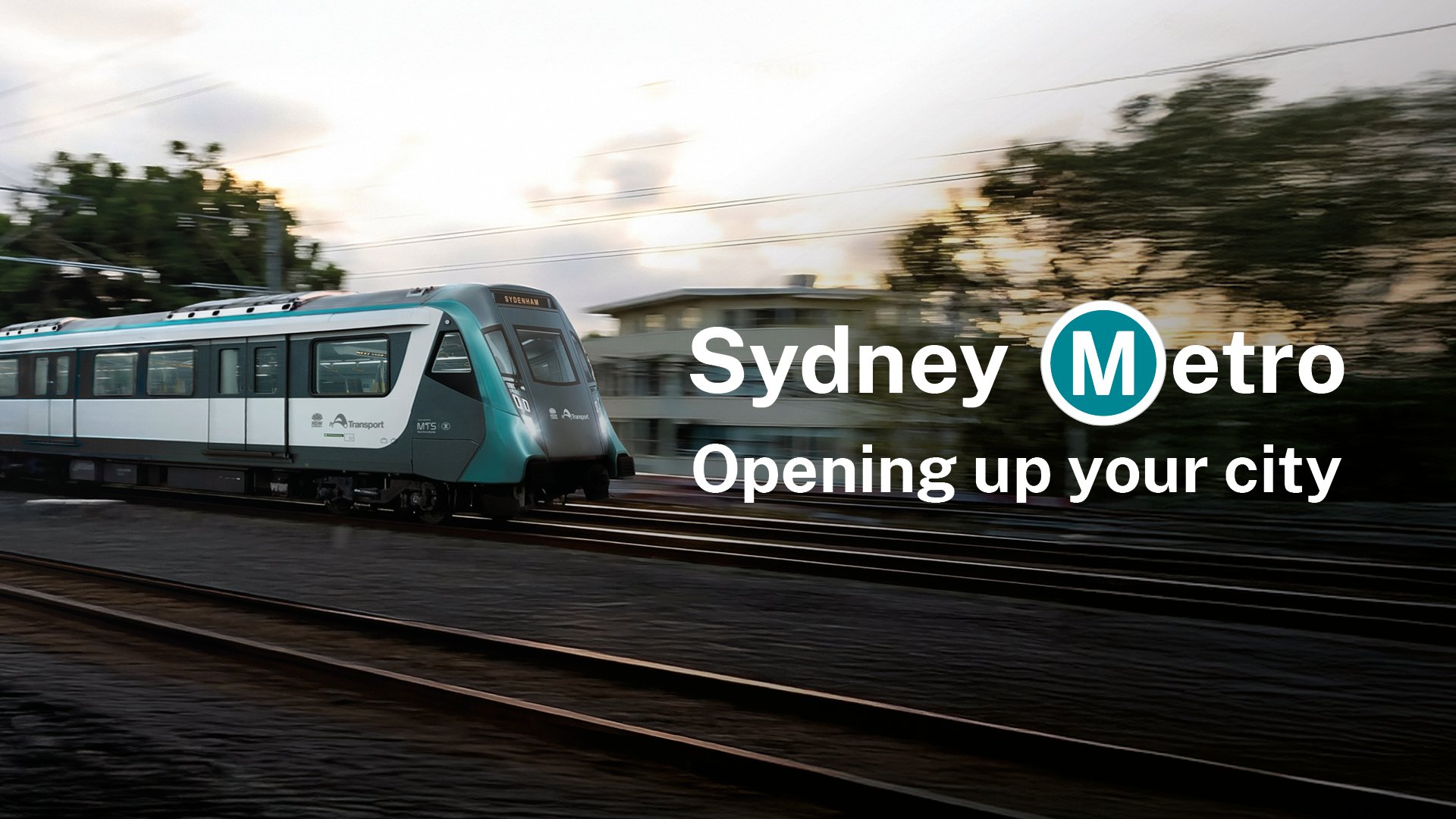
TfNSW Sydney Metro
Infrastructure Hoarding: Use of AI in Design
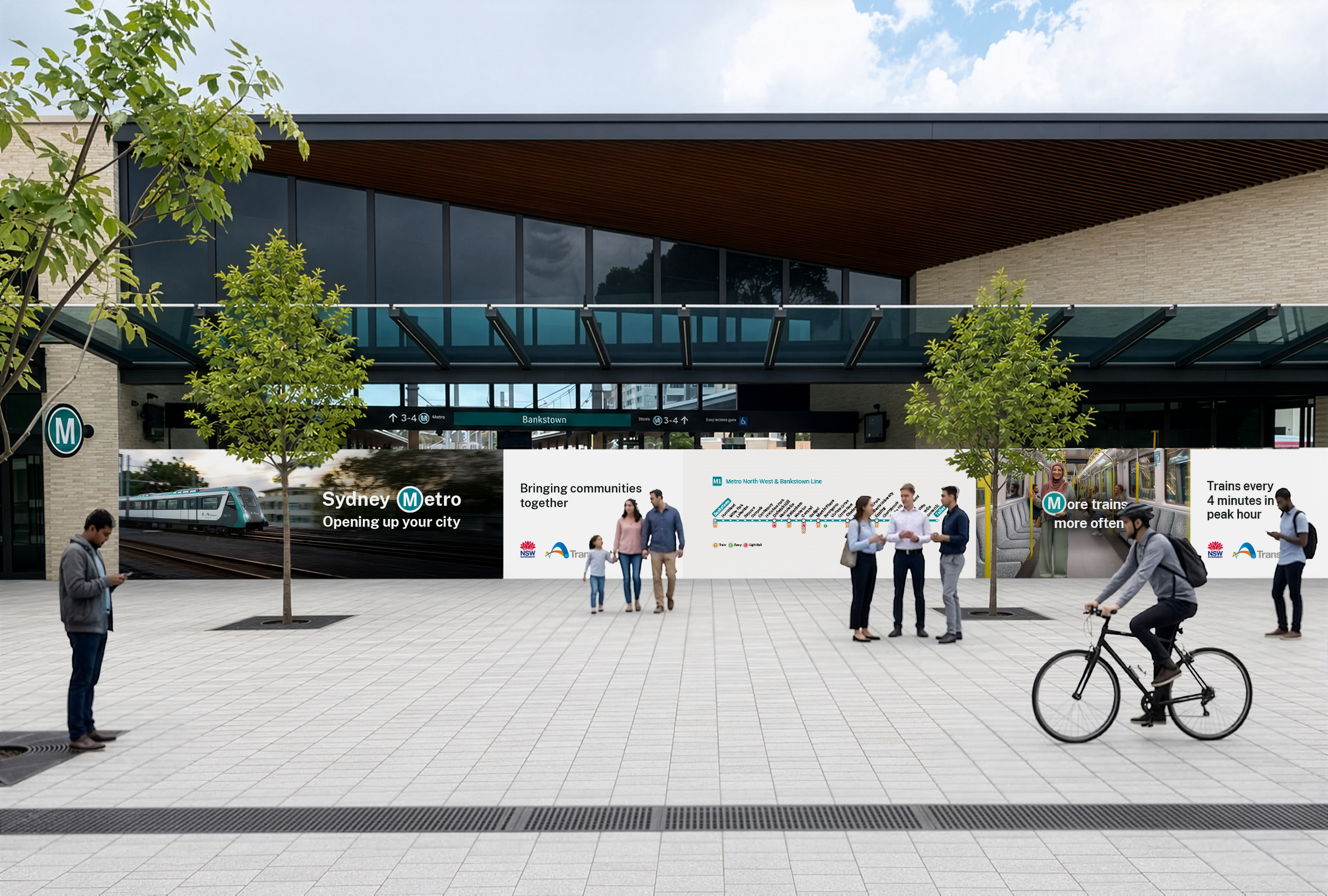
With the Bankstown Station plaza opening ahead of full Sydney Metro services, campaign-quality hoardings were required — carrying refreshed messaging, an updated line map and people photography consistent with the broader Metro brand. The work sat between two campaign phases: updating existing creative for an interim corridor that would later receive its own full launch treatment.
The central challenge was photography. No suitable assets existed showing the new above-ground Bankstown line, and there was no budget for a new photoshoot. After testing several AI generation tools, Higgsfield produced a convincing exterior scene from two reference images. Real train details and branding were composited back in Photoshop, then AI-upscaled to refine the result — delivering a campaign-grade hero image without a traditional commission.
With the photography resolved, the campaign creative was adapted and applied across the full suite of hoarding panels, balancing the existing Metro brand with the specific context of this interim opening.
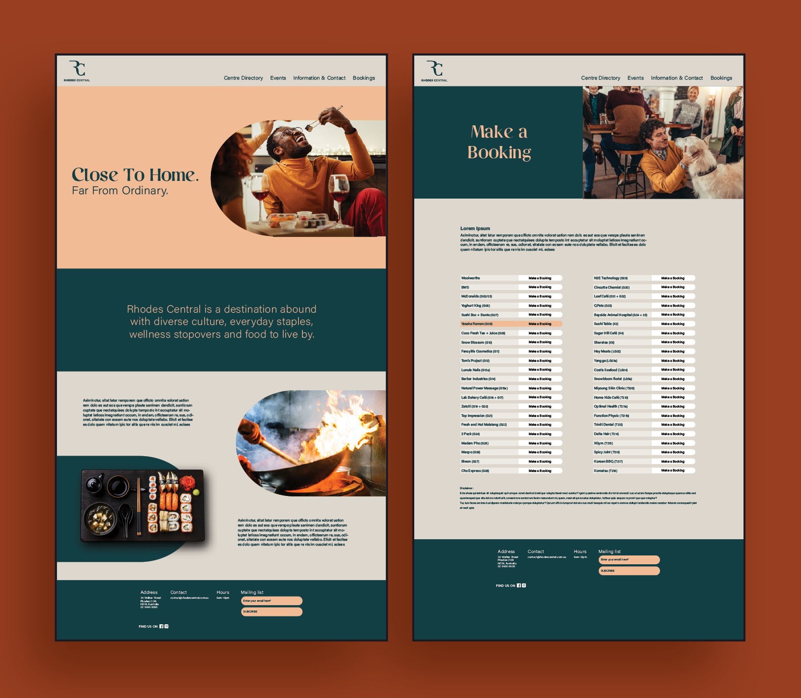
In early 2021, I collaborated with a creative agency to develop the brand and marketing strategy for Rhodes Central, a new retail and dining precinct in metropolitan Sydney. The project aimed to attract an upper-middle-class, multicultural audience with a taste for premium dining and shopping experiences. The branding needed to reflect a sophisticated, local lifestyle while highlighting the center’s diverse culinary offerings.
Working closely with the agency director and marketing manager, I designed a cohesive visual identity that spanned multiple platforms. This included the dining precinct logo, large-format signage, website mock-ups, social media rollout concepts, and branded merchandise. The project demonstrated my ability to create strategic, audience-focused design solutions across both digital and physical touchpoints.
Experience: Art direction, Branding, Large format print design, UI design, Concept development
Stock image selection, Pitch creative
Rhodes Central
Branding and marketing proposal


Tauranga Crossing
In mid-2020, the agency I worked for successfully pitched to update the branding for Tauranga Crossing Shopping Centre in New Zealand following its redevelopment. As the lead designer, I was heavily involved with creating mock-ups, defining branding elements, and materials to relaunch the centre.
Examples of collateral included billboard designs, hoarding, merchandise, posters, branding updates for the website, newsletter, gift cards, etc.
Experience: Art direction, Branding, Brand guidelines copy-righting, Large format print design, UI design, Concept development
Brand development

Reclaim PV recycling
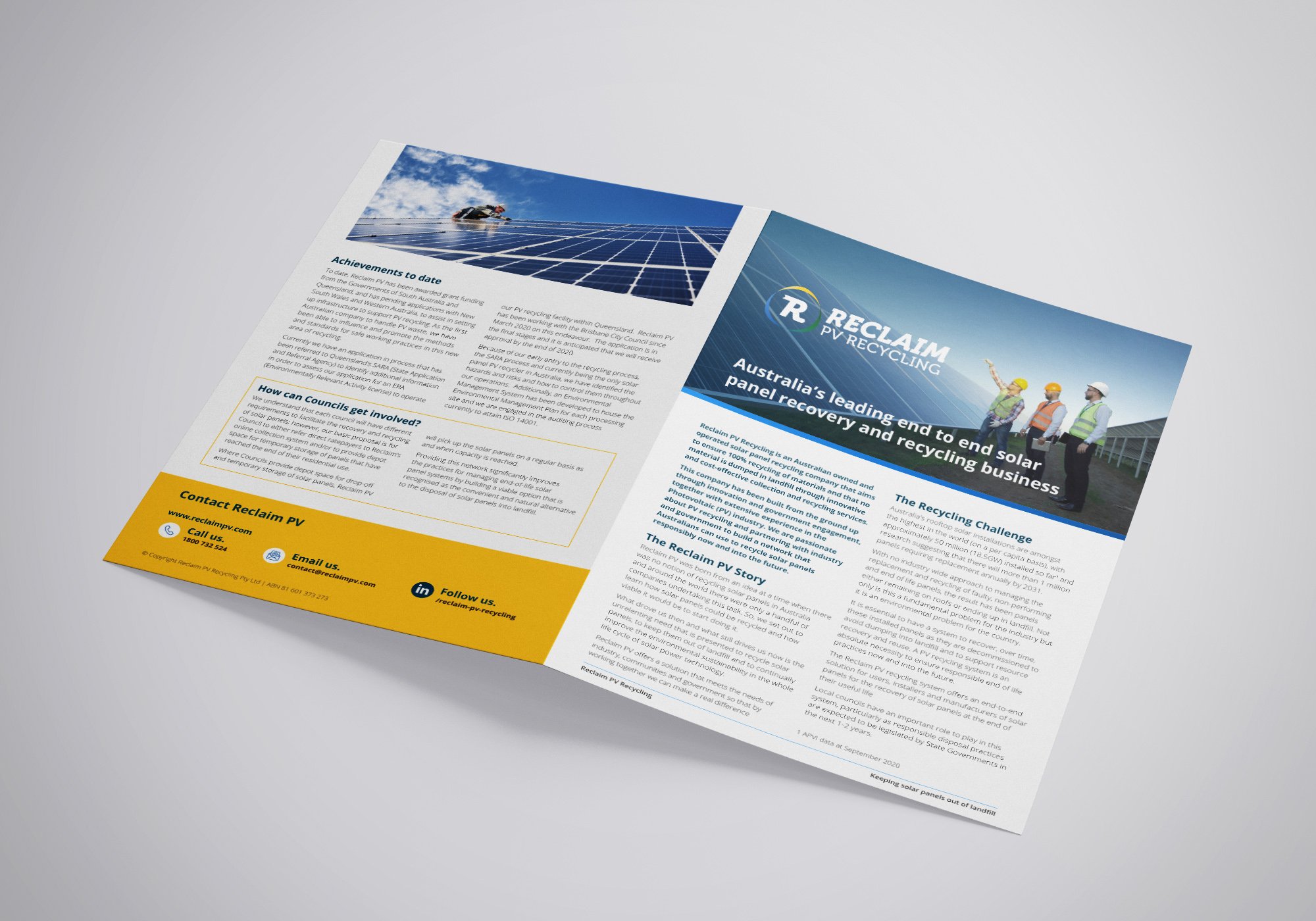
In late 2020 I worked with the startup Reclaim PV Recycling on new branding, brand guidelines, and the roll-out of printed and digital collateral for their November relaunch into the market. Reclaim PV operated Adelaide's first solar panel recycling facility and became heavily involved with industry and councils as the uptake of solar power grew across the country.
Experience: Brand Guidelines, Brand auditing, Logo creation, Iconography, Print layout, Colour selection, Website UI design
brand guidelines & identity

Envious Hair
Branding
As a freelancer, I was hired to design the logo and branding of a new salon business venture Envious Hair by Kellie. I aimed to capture the client’s bubbly personality through bold and bright colours, helping it stand out from other salons in the shopping strip.
Website UI prototype
This website mock-up builds on the branding created for the appointment cards and social media posts. Stock imagery has been used for demonstration purposes and the functionality of the Request an appointment feature is only a proof of concept.
Some issues that may arise are the nature of booking appointments and how they often overlap with other clients, depending on treatments. To combat this, all appointments requested online would receive a callback or text to confirm a booking.
Experience: Art direction, Colour design, Illustration, Logo design, Branding, Prototyping, User interface design